Curious to see how different cartographic parameters influence your perception of the “truth” or the story that the data tells? Check out this real-time tool to manipulate some of the parameters within the MapSuite package, and see how things change.
Go see the live visualization here!
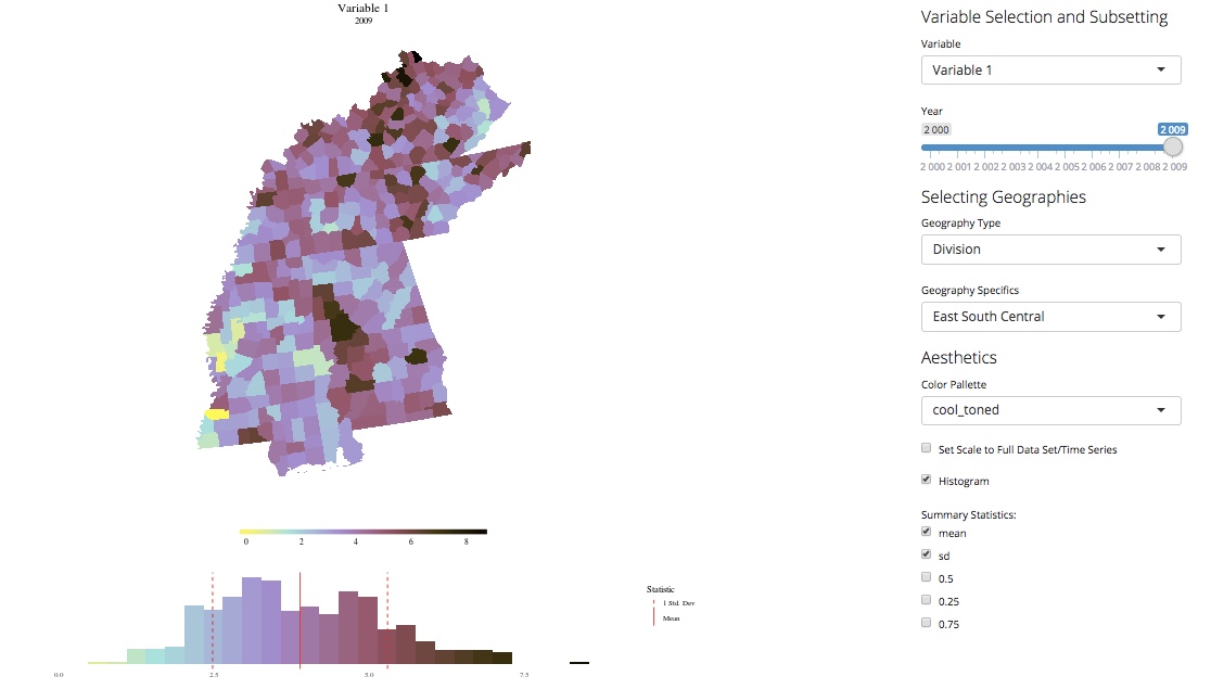
Want to explore how color choices impact your perception of county-level (real, not just simulated, like above!) socioeconomic data? Check out this visualization for a time series starting in 1980 based on publically available data (intervening years between the Census/American Community Surveys have been interpolated).