Sometimes it can be nice to view data in R much the way we would explore a spreadsheet in Excel using “heatmap”. However, in R, it takes a few extra steps to show the numeric values underlying the color distribution.
First, we can load in the libraries we need:
# Defining libraries required
  library(data.table)
  library(ggplot2)
  library(ggthemes)
Now, we can make a “theme” that describes the formatting we desire, and that can be applied to a GGplot object:
# Defining the ggplot2 theme() theme_custom() to use with graphics-----------------------------------------
theme_custom<- function(base_size=14, base_family="sans",map=TRUE,legend_position="bottom",legend_direction="horizontal") {
  print("If you use this for a map, you must add coord_fixed() to your plot!")
  ((theme_foundation(base_size=base_size, base_family=base_family)+theme(

    # Titles and text----------------------------------------------------------

    plot.title = element_text(face = "plain", size = rel(1.2), hjust = 0.5),
    text = element_text(),
    panel.background = element_rect(colour = NA),
    plot.background = element_rect(colour = NA),
    panel.border = element_rect(colour = NA),
    # Panel outlines
    panel.grid.major = element_blank(),#element_line(colour="#f0f0f0"),
    panel.grid.minor = element_blank(),

    # Legends----------------------------------------------------------------
    legend.key = element_rect(colour = NA),
    legend.position = legend_position,
    legend.direction = legend_direction,
    legend.key.size= unit(0.4, "cm"),
    legend.margin = unit(0, "cm"),
    legend.title = element_text(face="plain"),

    # Margins----------------------------------------------------------------
    plot.margin=unit(c(10,5,5,5),"mm"),
    strip.background=element_rect(colour="#f0f0f0",fill="#f0f0f0"),
    strip.text = element_text(face="bold")))+

     # Adding Axis labels (map specific or no):--------------------------------
   if(map){
     theme(
       axis.title =element_blank(),
       axis.title.y = element_blank(),
       axis.title.x =element_blank(),
       axis.text = element_blank(),
       axis.line = element_blank(),
       axis.ticks = element_blank())
   }else{
     theme(
       axis.title = element_text(face = "bold",size = rel(1)),
       axis.title.y = element_text(angle=90,vjust =2),
       axis.title.x = element_text(vjust = -0.2),
       axis.text = element_text(),
       axis.line = element_line(colour="black"),
       axis.ticks = element_line())
   }
  ) # Closing the theme() object
}# Closing theme_wmap() function
Next, we need to make a heatmap! First, we simulate a data set:
# Simulating a data set:
example<-data.table(CJ(c("apple","pear","orange"),c("1","2","3")))
example[,simulated_var:=rnorm(nrow(example),0)]

##        V1 V2 simulated_var
## 1:  apple  1     1.1611678
## 2:  apple  2     0.6251873
## 3:  apple  3     1.6726205
## 4: orange  1     1.6069261
## 5: orange  2    -0.4950747
## 6: orange  3    -0.7812395
## 7:   pear  1     0.8852081
## 8:   pear  2    -0.6865296
## 9:   pear  3     0.4873129

example[,Fruit:=as.factor(V1)] # We are creating a factor version of the V1 variable created earlier, with a nice-looking name.

##        V1 V2 simulated_var  Fruit
## 1:  apple  1     1.1611678  apple
## 2:  apple  2     0.6251873  apple
## 3:  apple  3     1.6726205  apple
## 4: orange  1     1.6069261 orange
## 5: orange  2    -0.4950747 orange
## 6: orange  3    -0.7812395 orange
## 7:   pear  1     0.8852081   pear
## 8:   pear  2    -0.6865296   pear
## 9:   pear  3     0.4873129   pear
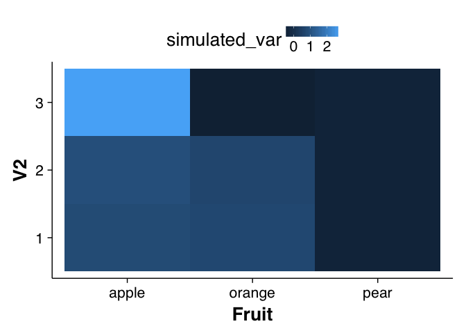
And make a basic heatmap:
# Making your heatmap
heat_map<-ggplot(data=example,
       aes(x = Fruit, y = V2, fill = simulated_var))+
       geom_tile() # This is what makes it a heat map

print(heat_map)

Note that the variables you provide for the x and y parameters for the ggplot object should both be factors, while the variable you use for “fill” should be numeric.
Now, we add on the custom theme:
heat_map<-heat_map+theme_custom(legend_position="top",base_size=20,map=F)

## [1] "If you use this for a map, you must add coord_fixed() to your plot!"

## Warning: `legend.margin` must be specified using `margin()`. For the old
## behavior use legend.spacing

print(heat_map)
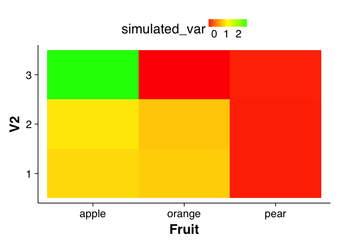
And, we can define a color scale (we’ll do a simple red/yellow/green color gradient for now) that defines the heatmap:
heat_map<-heat_map + scale_fill_gradientn(colours=c("red","yellow","green"))
print(heat_map)
Now, as the last step, we can add on text objects, based on a rounded version of the simulated data set, along with a legend showing the value.
heat_map<-heat_map+geom_text(aes(label = round(simulated_var, 1)),colour="black")+
  guides(fill=guide_colourbar(title="Value", barheight=1, barwidth=10, label=TRUE, ticks=FALSE ))

print(heat_map)
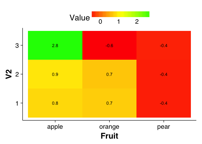
Voila! A heatmap, with color-coded values, and a helpful text indicator for each pixel, to boot.